Liquidation heatmaps have become one of the most talked-about tools in Bitcoin trading circles. These charts highlight the exact price levels where overleveraged traders could be forced out of their positions, creating potential volatility zones. For active traders, especially those in derivatives markets, this data can be as valuable as support and resistance levels.
In this guide, we’ll explain what Bitcoin liquidation heatmaps are, how to read them, and why they matter. We’ll also explore real-world examples, limitations, and how platforms like Coinperps provide traders with a high-quality Bitcoin liquidation heatmap that makes spotting opportunities far easier.
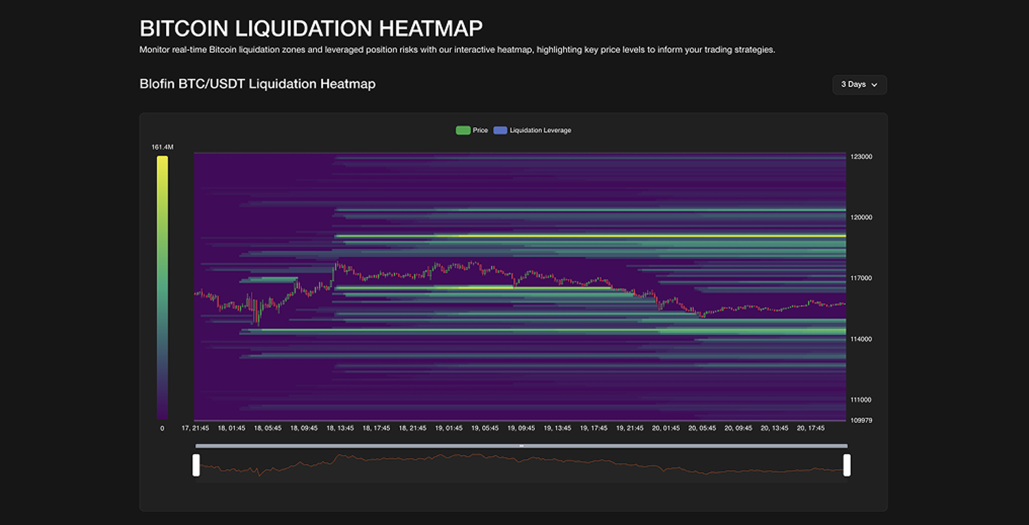
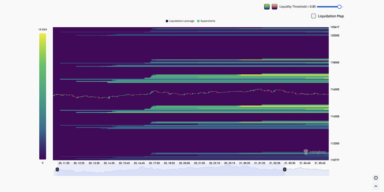
What Is a Bitcoin Liquidation Heatmap?
A Bitcoin liquidation heatmap is a visual chart showing where leveraged positions are likely to be liquidated if price reaches certain levels.
- Bright zones (yellow/orange): High liquidation clusters.
- Dark zones (blue/green): Lower liquidation density.
These zones often act like magnets. When price approaches an area stacked with liquidation orders, volatility tends to spike. Traders use these zones to anticipate where the market may move next.
Why Do Liquidations Matter?
Liquidations occur when a trader’s margin balance falls below the required maintenance level. On perpetual futures exchanges such as BloFin, this happens automatically.
- For longs: Liquidation occurs if price drops toward their stop-out level.
- For shorts: Liquidation occurs if price rises against them.
When thousands of traders are positioned around the same level, a liquidation cluster forms. These clusters often fuel sudden cascades of buying or selling pressure, creating sharp moves.
How to Read a Bitcoin Liquidation Heatmap
Key Elements of the Chart
- Colour coding: Yellow = high liquidation zones, blue = low.
- Horizontal bands: Price levels where orders cluster.
- Candlestick overlay: Shows Bitcoin’s actual price movement.
- Volume scale: Measures the notional value of liquidations at each level.
Step-by-Step Reading
- Look for bright yellow bands above or below the current price.
- Determine whether the majority of traders are long or short.
- Anticipate where liquidations may trigger, then plan entries or exits accordingly.
How Liquidation Zones Influence Price
The “Magnet Effect”
Markets often gravitate toward areas with stacked liquidation orders. Think of these zones as liquidity pools: when price edges closer, it tends to accelerate into them, triggering liquidations and creating volatility.
Support and Resistance
Liquidation clusters frequently align with psychological levels. A zone of stacked long liquidations may form strong support, while a concentration of short liquidations may act as resistance.
Confirmation With Other Indicators
Smart traders don’t rely on heatmaps alone. Combining them with open interest data, funding rates, or buying and selling pressure heatmaps can strengthen conviction.
Practical Example: Bitcoin Heatmap in Action
Imagine Bitcoin is trading at $86,000. A heatmap shows a thick yellow band around $88,500. This suggests many short positions would be liquidated if Bitcoin climbs higher.
- If price begins trending upward with rising open interest, there’s a strong chance it will test that $88,500 zone.
- Once triggered, shorts are forced to buy back into the market, fueling additional upside momentum.
On the flip side, if the chart highlights stacked liquidations at $83,000, longs could be wiped out if price retraces, potentially accelerating a downward move.
Where to Access Bitcoin Liquidation Heatmaps
Coinperps Bitcoin Liquidation Heatmap
One of the most reliable resources is the Bitcoin Liquidation Heatmap. Unlike generic tools, Coinperps integrates liquidation data with open interest, funding rates, and long/short ratios, offering traders a complete picture.
Traders benefit from:
- Real-time updates across major exchanges.
- Multi-timeframe heatmaps (12h, 24h, 7d, 30d).
- Cross-metrics analysis, combining liquidations with order book depth.
For those trading perpetual futures, having all of this data in one dashboard makes decision-making faster and more accurate.
Other Tools
- CoinGlass: Widely used, covers multiple exchanges.
- Coinalyze: Useful for open interest overlays.
While each has value, active derivatives traders often prefer Coinperps due to its focus on perpetual markets.
Limitations of Liquidation Heatmaps
- Lagging Updates
Heatmaps refresh every few minutes, so sudden shifts may go unnoticed during extreme volatility.
- Exchange Bias
Most heatmaps source data from a single exchange (e.g., Binance). Traders should compare across platforms for accuracy.
- Spoofing Risk
Large traders sometimes add and remove orders to mislead retail traders, making some clusters unreliable.
- Lack of Intent
A heatmap shows potential liquidations, not guaranteed execution. Many traders close positions before liquidation is triggered.
Liquidation Heatmaps vs. Traditional Indicators
| Feature | Heatmaps | Traditional Indicators |
| Data Type | Future liquidation zones | Past price & volume |
| Use Case | Spotting liquidity pools | Confirming trends |
| Advantage | Predictive “magnet” effect | Simpler for beginners |
| Weakness | Can mislead if spoofed | Lags actual market behaviour |
Heatmaps provide spatial awareness, while indicators like RSI or MACD show momentum and trend strength. Using both together yields a stronger trading edge.
Who Should Use Bitcoin Liquidation Heatmaps?
Ideal For
- Day traders: Spotting intraday reversal zones.
- Swing traders: Identifying support/resistance clusters.
- Leverage traders: Managing risk and avoiding liquidation cascades.
- Technical analysts: Confirming setups with liquidity data.
Not Ideal For
- Long-term holders: Short-term liquidation zones have little relevance for multi-year investors.
- Beginners without risk controls: Heatmaps are advanced tools that require discipline.
Combining Heatmaps for Stronger Insights
- Liquidation + Open Interest: Reveals whether new money is entering the market.
- Liquidation + Funding Rates: Highlights if traders are overpaying to hold long or short positions.
- Liquidation + Sentiment Heatmaps: Confirms whether crowd behaviour aligns with potential liquidation targets.
Conclusion
Bitcoin liquidation heatmaps are not crystal balls, but they are one of the sharpest tools traders can add to their arsenal. By showing where forced liquidations are likely to occur, they help explain why markets often accelerate into certain price levels.
For short- to mid-term traders, especially those using leverage, these maps provide actionable insights that can complement existing strategies. Pairing them with open interest, funding rates, and sentiment analysis makes them even more powerful.
For traders who want to move beyond heatmaps, BloFin Academy offers professional research articles & 101 lessons on macro insights, derivatives analysis, risk management, trading strategies inspiration, crypto industry tracking, trend following, etc.
FAQ: Bitcoin Liquidation Heatmaps
What is a liquidation heatmap? A chart that highlights price zones where traders using leverage could be liquidated, often colour-coded from blue (low) to yellow (high).
Why does Bitcoin price often move toward liquidation zones? Because liquidity acts like a magnet. Market makers may push price toward clusters to trigger liquidations.
Are liquidation heatmaps predictive? Not directly. They show potential pressure points but should be combined with other indicators.
Can I use them for altcoins? Yes. Heatmaps exist for Ethereum, XRP, SOL, and many other major trading pairs.
Is this tool useful for long-term investing? Not really. It’s designed for active traders managing short-term volatility.